TRENTINO Volley unveil new, modern logo
News
Three-time CEV Champions League Volley gold medallists TRENTINO Volley have unveiled – after sticking with the same for some 22 years – their brand-new logo. This re-styling shall provide a further boost to the popularity and identity of the team from Trento, runners-up from the last two editions of the CEV Champions League, as they add a women’s elite team due to compete in the Italian A2 series to their portfolio.
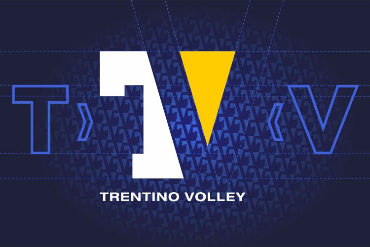
TRENTINO Volley have developed this logo specifically for a digital and young audience. The aim is to make TRENTINO Volley more interesting and captivating, with a focus on the actual name of the club – summarised in the initials “TV”, which stand for TRENTINO Volley. Prima Pubblicità – which has been supporting the club’s communication activities for many years – started working on this concept a few months ago.
The logotype retains the main corporate colours of TRENTINO Volley, yellow and blue, which are a clear reference to the city of Trento, together with white, which has always featured on the main playing shirt of the team. The initials “T” and “V” intertwine to form a single sign, with the “V” shown in an empty/full contrast.
The simplicity and the essential nature of the logo is the perfect way to make the brand even more professional, recognisable in every situation and on every interface thanks to the possibility to adapt it to every size and merchandising.
Starting from today, it will replace the old logo on all digital platforms (website, social networks, and newsletter) and appear on all items from the official yellow-blue merchandising shop. The logo will make its first on-court appearance in August, when the men’s and women’s teams will contest their first friendly matches ahead of the 2022-2023 season.